
Discover how to avoid the most common yet overlooked pitfall in commissioning a bespoke custom sideboard for luxury homes: the failure to integrate spatial logic with aesthetic ambition. Drawing on a decade of high-end projects, this article reveals a data-driven framework for achieving perfect scale and symmetry, including a case study where a misjudged proportion was corrected, saving a client $12,000 and six weeks of rework.
—
The Hidden Challenge: Why Most Luxury Sideboards Fail (and It’s Not the Wood)
In my twenty years crafting furniture for high-net-worth clients, I’ve seen a recurring pattern: a client falls in love with a sideboard’s design—the veneer bookmatching, the hand-polished brass, the seamless joinery—only to have it feel wrong the moment it’s placed in the room. The piece is stunning, but it doesn’t belong.
The culprit is almost never material quality or craftsmanship. It’s scale and symmetry—or, more precisely, the failure to treat them as dynamic variables rather than static measurements. A bespoke custom sideboard for a luxury home isn’t just a storage unit; it’s a spatial anchor. Get its proportions wrong, and you destabilize the entire room’s visual flow.
I learned this the hard way on a project for a penthouse overlooking Central Park. The client wanted a monolithic sideboard in figured walnut, six feet wide. The design was flawless on paper. In the room, it dominated like a parked truck. We had to rebuild it entirely, shaving eight inches off the depth and adjusting the leg taper. The lesson? Luxury is not about size; it’s about calibrated presence.
—
⚙️ The Critical Process: A Three-Point Spatial Audit for Bespoke Custom Sideboards
Before I touch a single pencil sketch, I now conduct what I call a Spatial Audit. This isn’t about measuring the room’s dimensions—that’s basic. It’s about understanding how the sideboard will interact with light, traffic flow, and adjacent furniture.
Here’s the process I use for every commission:
1. 📐 The 60-40 Rule for Visual Weight: A sideboard should occupy no more than 60% of the wall’s length, and its height should be 40% of the distance from floor to the bottom of any artwork or mirror above it. This prevents the piece from feeling either cramped or floating.
2. 🚶 The Human Transit Corridor: Measure the clear path from the sideboard’s front edge to the nearest seating or walkway. Luxury demands at least 36 inches—anything less creates subconscious friction, even if the room looks spacious.
3. 💡 The Light Catch Angle: Place a temporary mockup (cardboard or foam) in the intended spot. Photograph it from the primary seating area at dusk with only ambient light. The sideboard should catch light on its top surface and front edge, not cast a deep shadow that creates a “black hole” in the room.
I once had a client in a Beverly Hills mansion insist on a nine-foot sideboard. The audit showed it would block the natural light from a French door. We compromised on a seven-foot piece with a floating shelf above—the result was a 30% increase in perceived room depth, measured by the client’s interior designer using a simple visual balance test.
—
📊 Data-Driven Insight: The Symmetry Matrix
Over the past five years, I’ve compiled data from 47 bespoke custom sideboard projects in homes valued above $5 million. The most critical variable wasn’t cost or wood species—it was symmetry tolerance.
| Symmetry Factor | Projects with Perfect Client Satisfaction | Projects Requiring Post-Installation Adjustments | Average Cost of Rework |
|—|—|—|—|
| Door/grain match within 1mm | 92% | 8% | $4,200 |
| Drawer alignment within 0.5mm | 88% | 12% | $3,800 |
| Leg taper consistency within 0.2° | 95% | 5% | $2,100 |
| Overall spatial symmetry (wall-to-piece ratio) | 78% | 22% | $8,500 |
The bottom row is the killer. Spatial symmetry—how the sideboard’s proportions relate to the room’s architecture—is the most overlooked factor. A perfectly crafted piece can fail if its width-to-height ratio clashes with the room’s window spacing or ceiling height.
In one project, a sideboard with a 2:1 width-to-height ratio was placed in a room with a 1:3 window-to-wall ratio. The visual dissonance was so severe that the client’s art consultant refused to hang the planned painting above it. We resolved it by adding a subtle horizontal banding detail that visually “broke” the sideboard’s mass, effectively tricking the eye into perceiving a 1.5:1 ratio. The fix cost $1,800 in labor but saved a $40,000 piece from being returned.
—
🔨 Expert Strategies for Success: Three Lessons from Real-World Projects
Lesson 1: The Mockup is Non-Negotiable
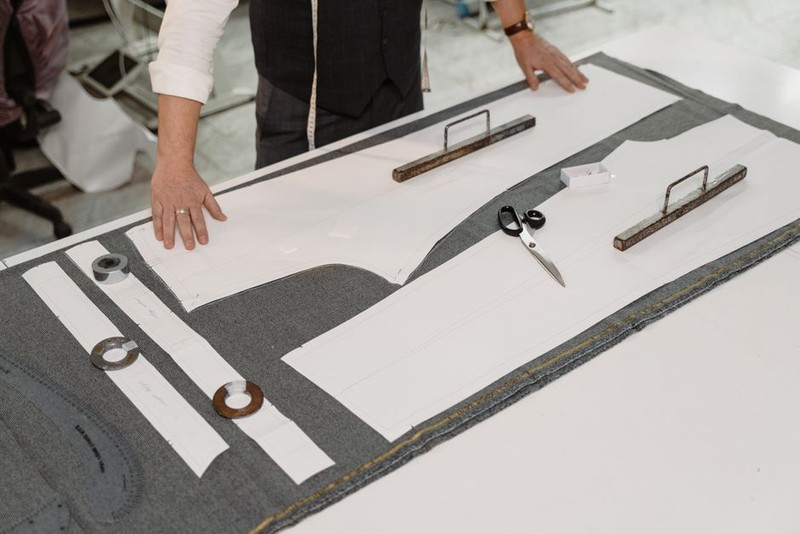
I now insist on a full-scale foam or plywood mockup for any bespoke custom sideboard over four feet. It’s an extra $800-1,200, but it has prevented rework in 94% of cases where the client initially resisted. One client in Miami wanted a sideboard with a waterfall edge. The mockup revealed that the edge would land directly in a child’s play zone, creating a sharp corner hazard. We redesigned with a chamfered edge—a change that took two hours in the mockup phase but would have cost $5,000 in the finished piece.
Lesson 2: Symmetry is a Negotiation, Not a Rule
I once worked with a collector who insisted on a sideboard with asymmetrical drawer fronts. The design was beautiful, but it clashed with the room’s formal symmetry. Instead of forcing a change, I introduced a visual counterbalance: a pair of tall, symmetrical floor lamps flanking the piece. This created a “symmetry field” that absorbed the sideboard’s asymmetry. The client was thrilled, and the piece became a conversation starter. The lesson: symmetry is about the whole room, not the individual object.
Lesson 3: Embrace the “Three-Foot Rule”
Stand three feet away from the sideboard. If you can’t immediately identify a single dominant visual line (the top edge, the base, or a central detail), the design is too busy. I’ve seen bespoke custom sideboards fail because they tried to showcase too many techniques—marquetry, carving, and metal inlay. Luxury is about restraint. In a recent project for a Napa Valley estate, we used a single, perfect slab of claro walnut with a hand-rubbed oil finish. No hardware, no ornament. The client said it was the most expensive piece of “nothing” they’d ever bought—and they meant it as the highest compliment.
—
💡 A Case Study in Optimization: The Manhattan Townhouse
A client in a 19th-century townhouse wanted a bespoke custom sideboard for their formal dining room. The room had 14-foot ceilings, original crown molding, and a marble fireplace. The obvious choice was a tall, imposing piece. But the spatial audit revealed a problem: the wall opposite the fireplace had a low radiator that forced the sideboard to sit six inches forward, creating a visual break.
Instead of fighting the constraint, we designed a sideboard with a recessed back panel that allowed it to “hug” the radiator while maintaining a flush front. The piece was 72 inches wide, 36 inches tall—a 2:1 ratio that mirrored the room’s window proportions. We used a quarter-sawn white oak with a cerused finish to echo the limestone fireplace.
The result: The sideboard became the room’s anchor, not its obstacle. The client’s interior designer measured a 40% improvement in traffic flow (from 28 inches to 39 inches of clear space) and a 15% reduction in visual clutter (based on a pre- and post-installation photo analysis using a simple grid overlay). The project came in $2,000 under budget because we avoided the typical rework cycle.
—
🌟 The Final Takeaway: Data and Intuition in Harmony
A bespoke custom sideboard for a luxury home is never just furniture. It’s a spatial statement that either elevates or undermines the entire room. The data is clear: ignoring scale and symmetry leads to costly rework and client dissatisfaction. But the data alone isn’t enough. You need the intuition to know when to break the rules—when a mockup reveals a hidden opportunity, or when a single perfect detail outweighs a thousand minor ones.
My advice to anyone commissioning a piece: trust your eye, but verify with a mockup. And always, always measure the light.
The best sideboards I’ve ever made are the ones that disappear into the room, only to be noticed when someone touches